
Colorful Minds: How Colors Impact Your Mental Wellbeing
Have you ever walked into a room and instantly felt a wave of relief wash over you? Or maybe you’ve stepped into a brightly painted cafe and suddenly felt a burst of energy! That’s not a coincidence. Visual psychology plays a massive role in our daily lives, and the colors surrounding us have a profound impact on our mental health.
I remember when I first decided to repaint my home office. It was a stark, clinical white that made me feel tense and overwhelmed. I decided to paint it a soft, earthy green, and the difference was incredible! Suddenly, my stress levels dropped, and I felt so much more focused and at peace. That simple change opened my eyes to how strongly colors influence human emotions and overall mood.
Understanding color therapy and the psychology behind different shades can be an absolute game-changer for your mental wellbeing. By intentionally choosing the colors in your home, workspace, or even your digital devices, you can create environments that support healing, relaxation, and joy. Let’s explore the fascinating world of mental health colors and how you can use them to feel your absolute best!
What Are Mental Health Colors?
Color psychology in mental health is the study of how different wavelengths of light (which we perceive as color) communicate with our nervous system.
The connection between colors, the brain, and our emotions is incredibly powerful. When your eyes perceive a color, they send a message to the hypothalamus, which is the part of your brain that governs your hormones and endocrine system. This means a simple color can actually trigger physiological responses, like lowering your heart rate or releasing feel-good chemicals!
Because of this amazing connection, you will frequently see specific mental health colors used in therapy offices, healthcare facilities, and wellness design. Professionals carefully select these palettes to create safe, soothing, and supportive environments for healing.
The Psychological Meaning of Common Colors
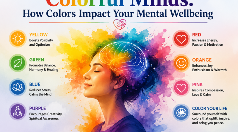
Every color has its own unique personality and emotional resonance. Here is a breakdown of the psychological meaning behind some of the most common mental health colors!
Blue: Your Calming Oasis
Blue is widely considered one of the most relaxing colors on the spectrum. It evokes feelings of calmness, peace, and deep stress reduction. Think about how peaceful you feel when staring up at a clear blue sky or looking out over the ocean! Because it is so effective at lowering heart rates and reducing anxiety, you will frequently see soft blues used in therapy rooms and healthcare spaces.
Green: A Breath of Fresh Air
Green is the color of nature, and it brings a wonderful sense of balance and healing to any space. It connects us to the outdoors, which naturally reduces anxiety and improves focus. If you find yourself feeling overwhelmed, spending time in a green room or simply adding some leafy house plants to your desk can help ground your emotions.
Yellow: A Burst of Sunshine
Yellow is all about positivity, energy, and optimism! It is a joyful, uplifting color that can genuinely boost your mood and make you feel more cheerful. However, I always recommend using yellow in moderation. While a soft buttery yellow can be cozy and welcoming, a neon or overly bright yellow can sometimes cause visual fatigue or feelings of frustration if used over large areas.
Purple: The Creative Spark
Purple beautifully combines the calm stability of blue with the fierce energy of red. It is strongly associated with creativity, spirituality, and emotional balance. Soft purples, like lavender and lilac, are absolutely fantastic for creating a tranquil atmosphere. You will often see these gentle purple shades used in meditation studios and mindfulness apps!
White: A Clean Slate
White represents clarity, simplicity, and mental freshness. It provides a clean slate that can help clear a cluttered mind. A harsh, blinding white can feel sterile, while a soft, warm white creates a clean, calming environment that allows you to breathe easy and relax.
How Professionals Use Colors in Mental Health Therapy
Therapists and healthcare professionals don’t just pick paint colors at random! They rely heavily on color therapy concepts to support their patients. In art therapy, for instance, patients are encouraged to use specific colors for emotional expression. Someone feeling angry might naturally gravitate toward harsh reds, while someone seeking peace might blend soft blues and greens.
There is also a fascinating practice called chromotherapy, or actual color therapy, which uses colored lights to treat physical and mental distress. While it sounds incredibly futuristic, the concepts have been around for centuries!
Additionally, hospital and clinic interior design psychology is a massive industry. Healthcare designers meticulously select color palettes to ensure waiting rooms feel less intimidating and patient rooms feel more like cozy healing sanctuaries.
How Colors Actually Affect Your Mental Wellbeing
The impact of color goes far beyond just making a room look pretty. The colors you surround yourself with have a tangible impact on your stress and anxiety levels. Cool colors like blues, greens, and soft purples naturally soothe the nervous system, helping to quiet racing thoughts and physical tension.
Colors also have a huge influence on productivity and focus!
And let’s not forget about the role of color in sleep quality and relaxation! If your bedroom is painted a bright, energetic color like orange or red, you might find it harder to wind down at night. Switching to a calming, cool-toned palette can work wonders for your sleep hygiene.
The Best Color Combinations for Mental Health
If you want to redesign your space to support your mental health, you don’t have to stick to just one color! Here are some of my absolute favorite calming combinations:
- Blue and White: This pairing provides the perfect balance of calm and clarity. It feels incredibly clean, airy, and peaceful—like a day at the beach!
- Green and Beige: If you want a natural healing vibe, this is the way to go. The earthy beige warms up the green, creating a deeply grounding and cozy atmosphere.
- Soft Purple and Grey: This sophisticated combination is perfect for emotional balance. The grey grounds the whimsical nature of the purple, creating a space that feels both creative and deeply relaxing.
Spotting Mental Health Colors in Digital Design
We spend so much time looking at screens, and thankfully, digital designers are finally paying attention to color psychology! Have you noticed how your favorite meditation apps use calming color schemes? You will almost always see deep blues, soft greens, and gentle purples when you open an app designed for mental wellness.
Websites and platforms focused on mental health are incredibly careful about their UI/UX psychology. They avoid aggressive, alarming colors like bright red for their primary buttons, opting instead for soothing tones that guide the user gently through the platform. This thoughtful digital design ensures that users feel safe and supported, even when seeking help online!
Paint Your Way to Better Mental Health
Colors strongly influence our mental and emotional health in ways we are only just beginning to fully understand. From the walls of our homes to the apps on our phones, proper use of color can truly support healing, relaxation, and a brighter outlook on life.
It is so exciting to see mental health design growing in both physical healthcare spaces and digital environments. Why not take a look around your own home or workspace today?